Create Your Word Portrait Using CSS
All you need to know about CSS background-clip property, with some interesting use cases.

I'm a self-taught Developer & B2B/B2C Writer. Passionate about creating content and helping people get into the tech 🔥
Talk about Remote Work, Open-Source, Web Development, Indie Hacking, and Personal Growth! 🙂
In this article, I'll introduce you to the background-clip property of CSS, with the help of which, we will make our Word portrait. Even if you are a beginner at CSS and HTML, you'll be able to do that. 😃
You might have seen a word portrait? ofcourse yes! But if I ask you that, have you ever created Your word portrait by yourself using CSS? Might not! But don't be worry about that, this article is for you, and by the end of this article, you will be able to create one for yourself. 💻
Prerequisites
Before we get started, I recommend that you have these prerequisites to follow along with this article:
- Very Basic HTML Knowledge
- Basic CSS knowledge
- Code Editing Software (or an account on Codepen.io)
Introduction
If I say that it's only 2 lines of code to create a portrait using CSS. You might think, I'm kidding you! 😅, but no, actually I'm not. You can indeed create a word portrait using CSS with only a few lines of code only, and this could be made possible by the background-clip property. Before we go, we first need to know about the background-clip property in CSS.
What is the background-clip property in CSS? What does it use for ??
In CSS, the background-clip property is used to add/clip Images, GIFs, Gradients, etc as a background of different content-boxes, elements including text. This property can be used for creating clip text, about which we will talk later in this article.
what can be the values of the background-clip property?
Let's have a look at the following flow-chart which shows the implementations of the background-clip property, that how background-clip works in different scenarios.
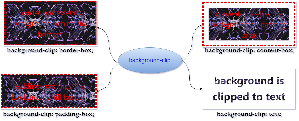
Including text, we have these values for the background-clip property: 👇👇
border-boxis the default value. This allows the background to extend all the ways to the outside edges of the element's border.padding-boxclips the background to the outside edge of the padding region.content-boxclips the background to the outside edge of the element's content region.initialsets the property to its initial/default value.inheritapplies the background-clip setting of the parent to the selected element.textis used for adding a background clip to the text.
That was the theory part you need to know to get started, Let's now understand it better with the help of the following code example:
HTML Code:
<div class="container-fluid">
  <p class="border-box"> border-box extends background behind the borders</p>
  <p class="padding-box">padding-box clips the background till border</p>
  <p class="content-box"> content-box clips the background till padding area</p>
  <p class="text"> background is clipped to text</p>
</div>
CSS Style: This is how the background-clip property is implemented.
p {
  font-size: 2rem;
  border: 0.5rem dashed;
  padding: 2rem;
  color: #d00000;
  text-align: center;
  background-image: url('https://images.unsplash.com/photo-1642444525640-d3eb287ed389?crop=entropy&cs=tinysrgb&fit=max&fm=jpg&ixid=MnwxNDU4OXwwfDF8cmFuZG9tfHx8fHx8fHx8MTY0NDEyOTE3Nw&ixlib=rb-1.2.1&q=80&w=400');
}
/* default --> border-box */
.border-box {
  background-clip: border-box;
}
/* Padding-box */
.padding-box {
  background-clip: padding-box;
}
/* content-box */
.content-box {
  background-clip: content-box;
}
/* text */
.text {
  font-weight: bold;
  -webkit-background-clip: text;
  background-clip: text;
  color: transparent;
}
Output:
This is how the background-clip property works in CSS. It clips this background to different boxes of an element as we have seen in the above example.
Animated Clip-Text
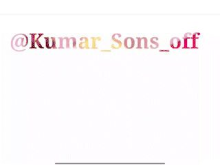
The above was the simple implementation of the background-clip property, but more interestingly, we can create an Animated clip-text by the use of this background-clip property, without using any animation property.
Here is how: You know what, for me, this was the best use case of this property when I discovered it accidentally. ☺️
HTML Code:
  <div class="clip-text">
    @Kumar_Sons_off
  </div>
CSS Code: You need the following CSS code for creating an animated-clip text.
.clip-text {
  /* You need a URL for a Gif */
  background: url(http://i.giphy.com/fsULJFFGv8X3G.gif);
  background-size: cover;
  background-position: center;
  -webkit-background-clip: text;

  color: transparent;
  // set to transparent, otherwise you won't see.

  width: 300px;
  height: 100px;
  box-sizing: border-box;
  font-size: 38px;
  font-weight: bold;
  text-align: center;
  line-height: 100px;
  flex-shrink: 0;
}
Output: This is how it looks.
Note: The background-clip: text property does not support many old browsers, So I created a GIF and added it here for the above output. But you can have the live codepen view from this CodePen link.
That was a lot much for the background-clip property for you to know, but let's have one more implementation or use case of this property.
CSS Word Portrait
I thought this is the most awaited part of this article. Finally, now, we are known enough to the background-clip property to create a word portrait. For that:
First of all, you need to have your photo with a plain background (for a better look) or it would be more better if it is with no background. You can use certain tools to remove background like remove.bg and all.
Code a Paragraph with the HTML of your wish. (don't forget to link the CSS file if you are using something other than codepen.io) 😆
Use the CSS
background-clipproperty and set its value to text like the following, and you need a direct link for your image if you are using Codepen.io. For that, you can use certain tools like postimages.org, or any other of your choice.
body {
  background-color: #000000;
}
/* adjust font accordingly */
p {
  background: url("https://i.postimg.cc/2jhGPtDJ/profile-pic-resized.png");
  -webkit-background-clip: text;
  background-clip: text;
  color: transparent;
  font-size: 0.5rem;
  background-size: cover;
}
Output:
Here is the view of the most awaited output of this article.
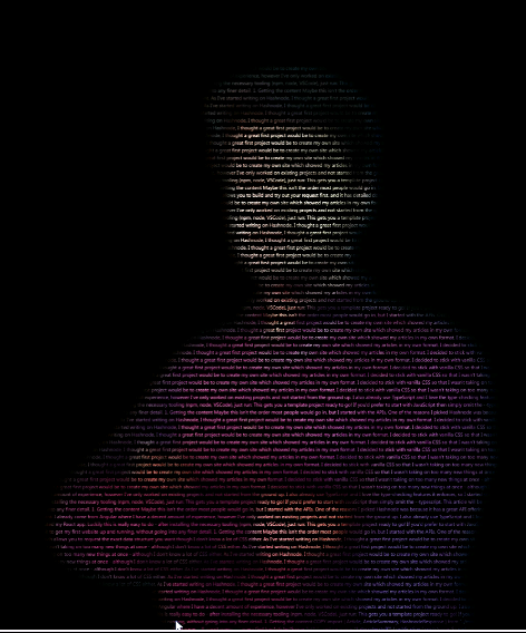
As I mentioned before the background-clip: text property is not supported in many versions of browsers that are still in use, so I've added an image here instead of the codepen live view. Yup, but you can see its live view from this CodePen. 😉
That's all you need to know about the background-clip property in CSS.
Conclusion
- We have covered all one need to know about
background-clipproperty. - I hope you find it useful. If yes, then let me know in the comments below, and consider sharing it with your friends.
- I would love to see if you have tried creating your portrait, feel free to drop a link to your Portrait codepen below.
- Also, You can Join me on Twitter 🐦, where I tweet more frequently about Tips and Resources for web developers.
- Thanks for Reading.
You can extend your Support by Buying me a coffee here.🌴

Published on: 02/07/2022.


